ggplot tricks
July 4, 2020
Here are some ggplot tricks that I shared at the R-Ladies Sydney June Show and Tell.
Why is my internet speed so terrible?
Working from home and pivoting to teaching online has made me realise that my wifi connection is really bad, particularly when it rains. I have been teaching new honours students R and needed a little dataset to demo how to get data into R, so made a google form and put it out on twitter to confirm to myself that my connection really is worse than most other people. You can contribute to the data here.
Packages for reading data into R
library(tidyverse) # includes readr for .csv files
library(readxl) #for excel files
library(googlesheets4) #read straight from google sheets
library(datapasta) # for pasting data into R
library(janitor) # quick name cleaning
1. read csv or xlsx
The standard way to get data into R is to read a file that you have downloaded.
Read a .csv file
speed1 <- read_csv("crappy_internet.csv")
Read an excel file
speed2 <- read_excel("crappy_internet.xlsx")
2. direct from google docs
But the googlesheets4 package allows you to authenticate your google account and read data straight from from googlesheets using only the url. More info here https://googlesheets4.tidyverse.org/
speed3 <- read_sheet("https://docs.google.com/spreadsheets/d/1yyl4fNMErNQ5mQaYgc2ELF7zF6cEPcfRNUtWr56nkg8/edit#gid=552570759") %>%
  clean_names()
3. datapasta
Alternatively, you can copy and “paste” the data into R using the datapasta package. Find the vignette here
speed4 <- # select your data and do Ctrl-C, put your cursor here, and choose Addins, paste as dataframe, and then run the chunk
Packages for plotting
library(ggbeeswarm) # add noise to point plots
library(ggeasy) # easy wrappers for difficult to remember ggplot things
library(papaja) # this is mostly a package for writing APA formatted manuscripts, but it also includes a ggplot theme that is nice
First make the data long
speedlong <- speed3 %>%
  select(where_do_you_live, is_it_raining, ends_with("speed")) %>%
  pivot_longer(names_to = "updown", values_to = "speed", download_speed:upload_speed)

speedlong$is_it_raining <- fct_relevel(speedlong$is_it_raining, c("Yes", "No"))
Plot up and download speeds.
There is 1 lucky person in the dataset who apparently has download speeds of > 150 mb/s, just filtering them out of each plot.
1. geom_point()
speedlong %>%
  filter(speed < 100) %>%
 ggplot(aes(x = updown, y = speed)) +
  geom_point(size = 3)
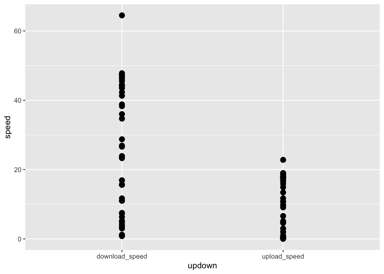
This plot is ok, but all the points are on top of each other. Use the ggbeeswarm package to add a little noise.
2. geom_beeswarm()
speedlong %>%
  filter(speed < 100) %>%
 ggplot(aes(x = updown, y = speed)) +
  geom_beeswarm(size = 3)
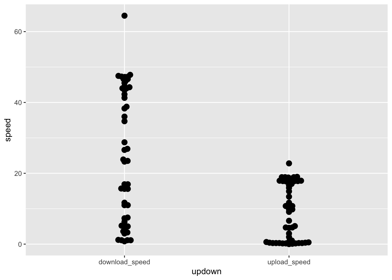 Beeswarm is better but I’d like more noise.
3. geom_quasirandom()
speedlong %>%
  filter(speed < 100) %>%
 ggplot(aes(x = updown, y = speed)) +
  geom_quasirandom(width = 0.2, size = 3)
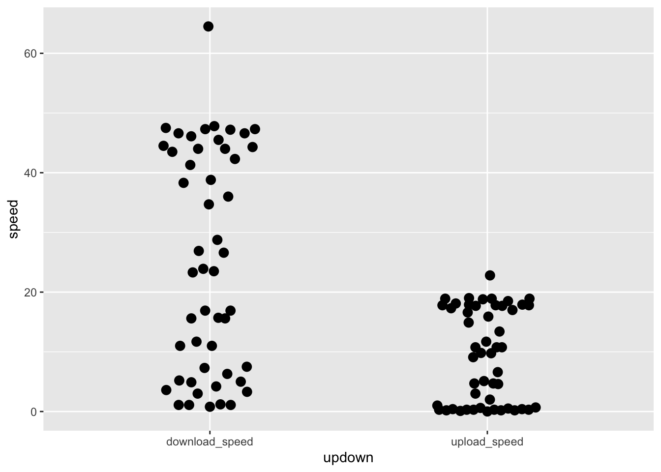
Now I want to know which of these points were collected when it was raining.
4. colouring the points
speedlong %>%
  filter(speed < 100) %>%
 ggplot(aes(x = updown, y = speed, colour = is_it_raining)) +
  geom_quasirandom(width = 0.2, size = 3)

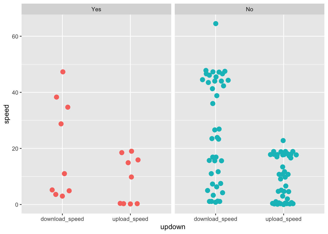
5. facet_wrap()
speedlong %>%
  filter(speed < 100) %>%
 ggplot(aes(x = updown, y = speed, colour = is_it_raining)) +
  geom_quasirandom(width = 0.2, size = 3) +
  facet_wrap(~ is_it_raining)
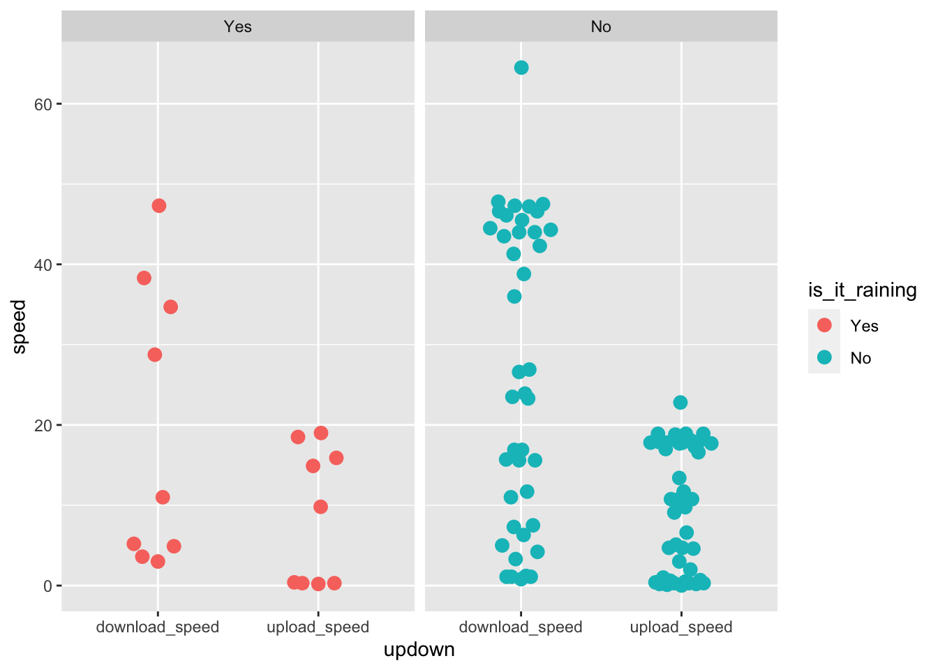
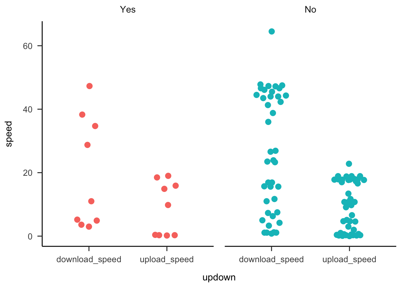
Making ggplot easy
Now this version has lots of duplicated information. We probably don’t need the legend. How to remove the legend is something I have to google EVERY TIME. The ggplot solution is + theme(legend.title = element_blank()) — hard to remember
6. easily remove the legend
speedlong %>%
  filter(speed < 100) %>%
 ggplot(aes(x = updown, y = speed, colour = is_it_raining)) +
  geom_quasirandom(width = 0.2, size = 3) +
  facet_wrap(~ is_it_raining) +
  easy_remove_legend()
7. fix the formatting
I really dislike the grey default of ggplot. Use theme_apa() to get nice formatting
speedlong %>%
  filter(speed < 100) %>%
 ggplot(aes(x = updown, y = speed, colour = is_it_raining)) +
  geom_quasirandom(width = 0.2, size = 3) +
  facet_wrap(~ is_it_raining) +
  theme_apa() +
  easy_remove_legend()
Getting plots out of ggplot
Option 1: ggsave()
Put ggsave(“nameofplot.png”) at the end of each chunk and it will export the most recent plot.
ggsave("testplot.png")
Option 2: RMarkdown magic
Use fig.path in your RMarkdown setup chunk (the one that looks like this at the top of your .Rmd) to export all your plots to a figures folder.

This is where chunk labels are important. If your chunks are not labelled the exported files will be called “unnamed-chunk-somenumber.png” BUT if you label the chunk the file name of the exported plot will be meaningful.
Check out the RMarkdown reference guide for details
- Posted on:
- July 4, 2020
- Length:
- 4 minute read, 730 words
- See Also: